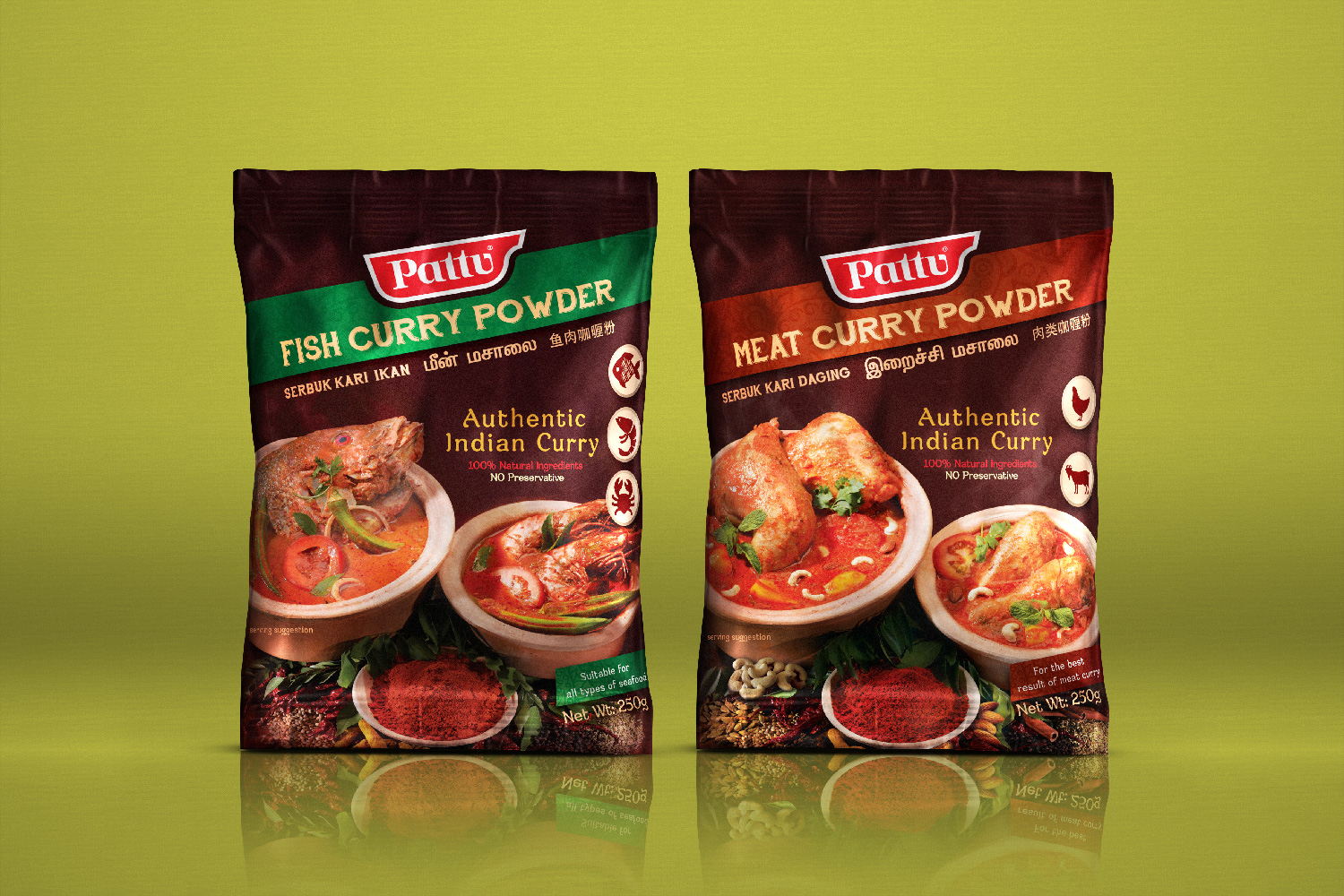
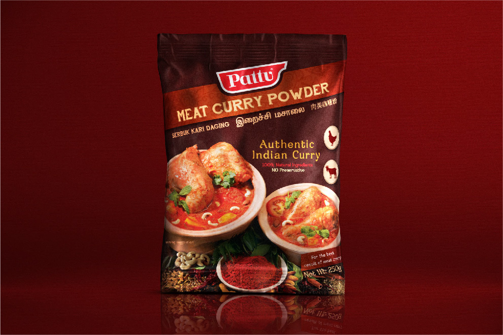
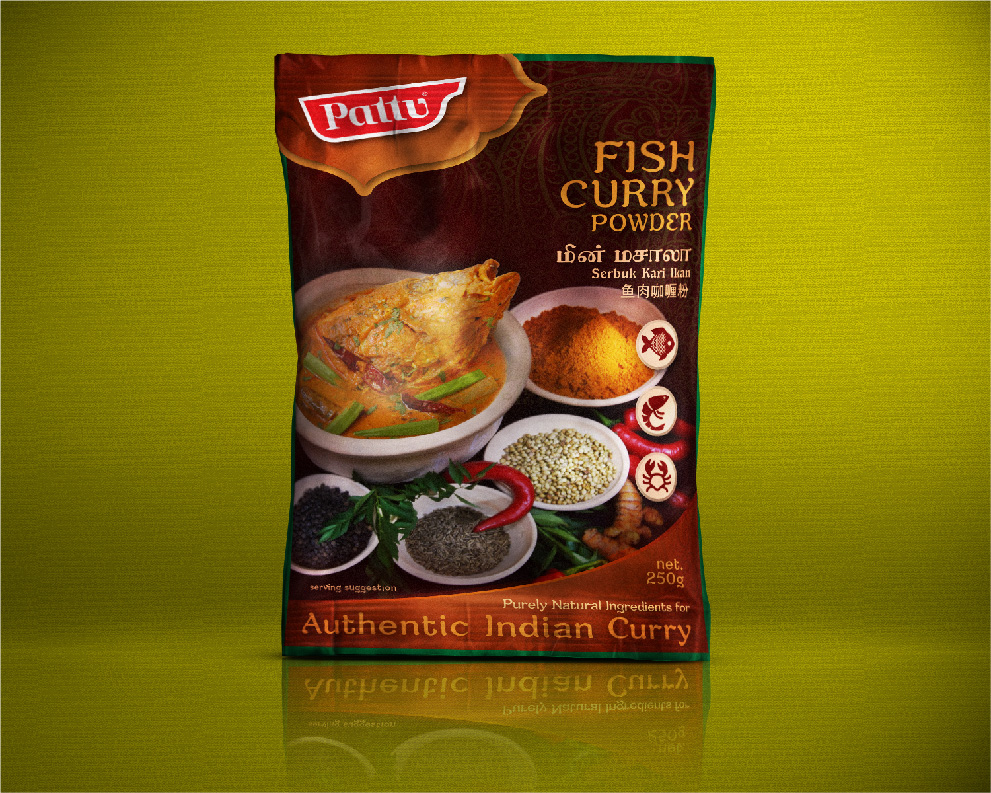
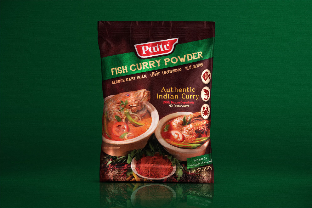
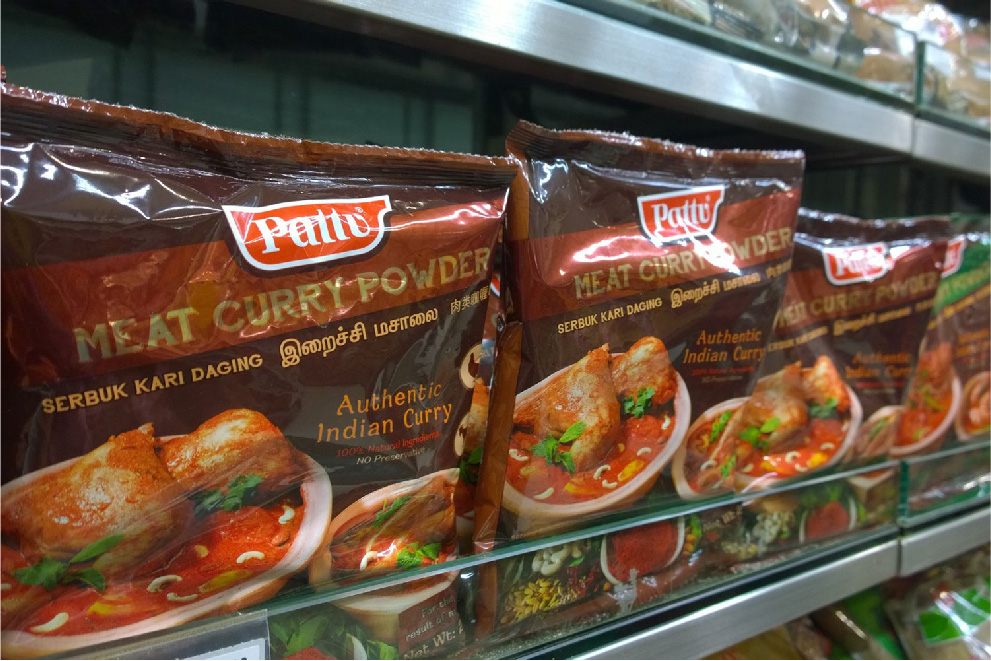
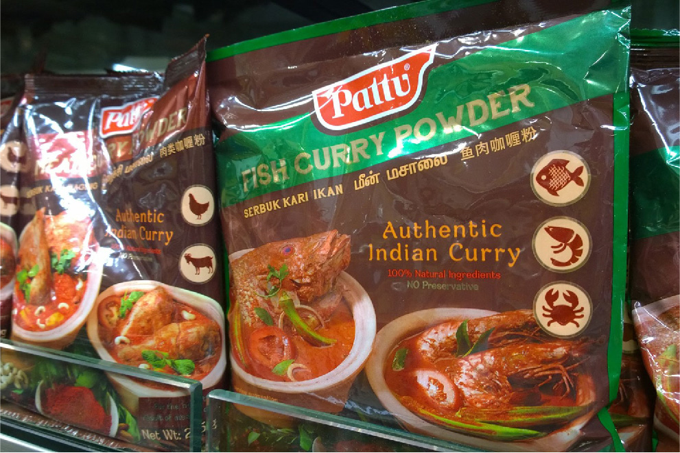
Pattu
Curry Powder Packaging Design
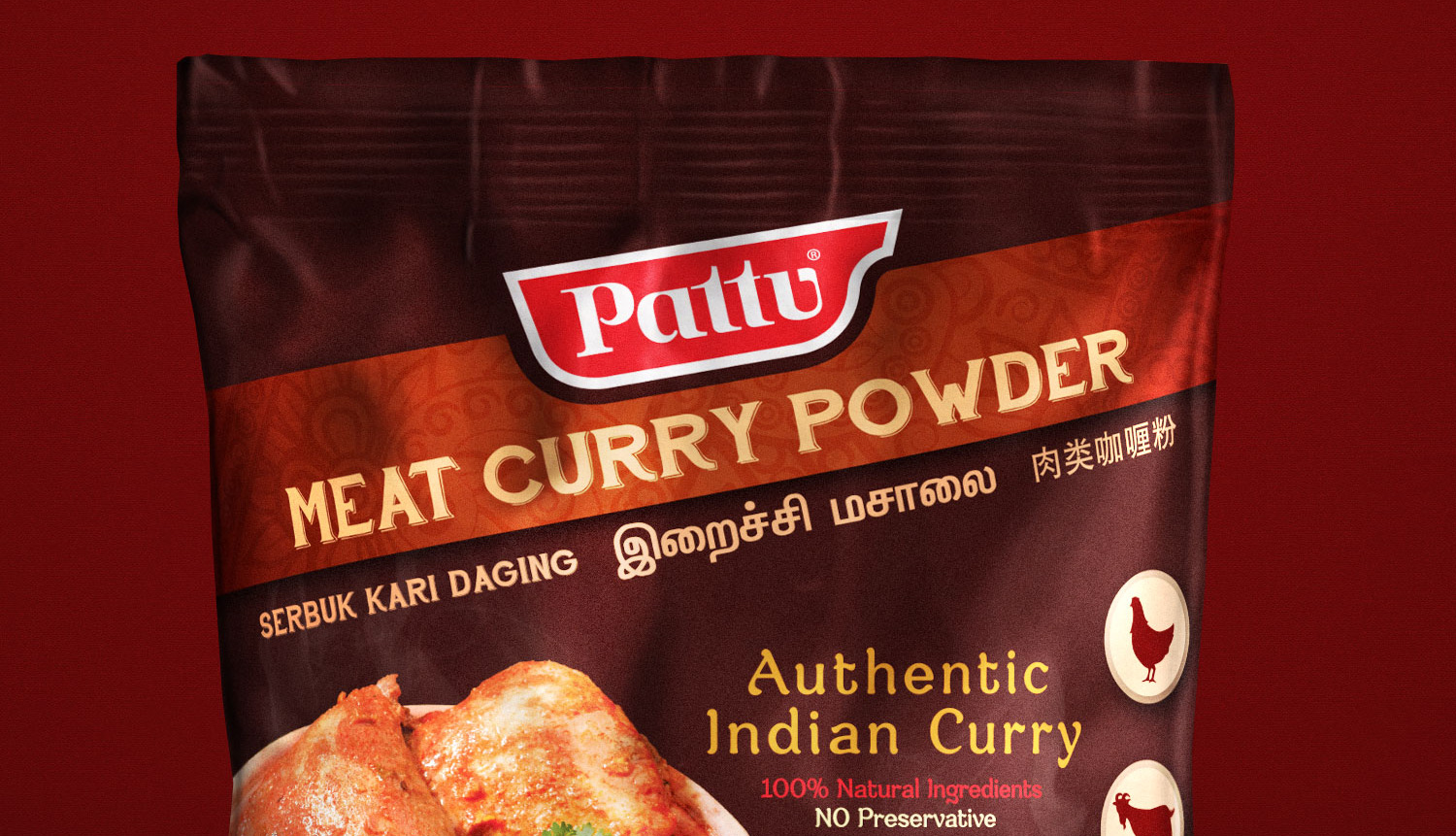
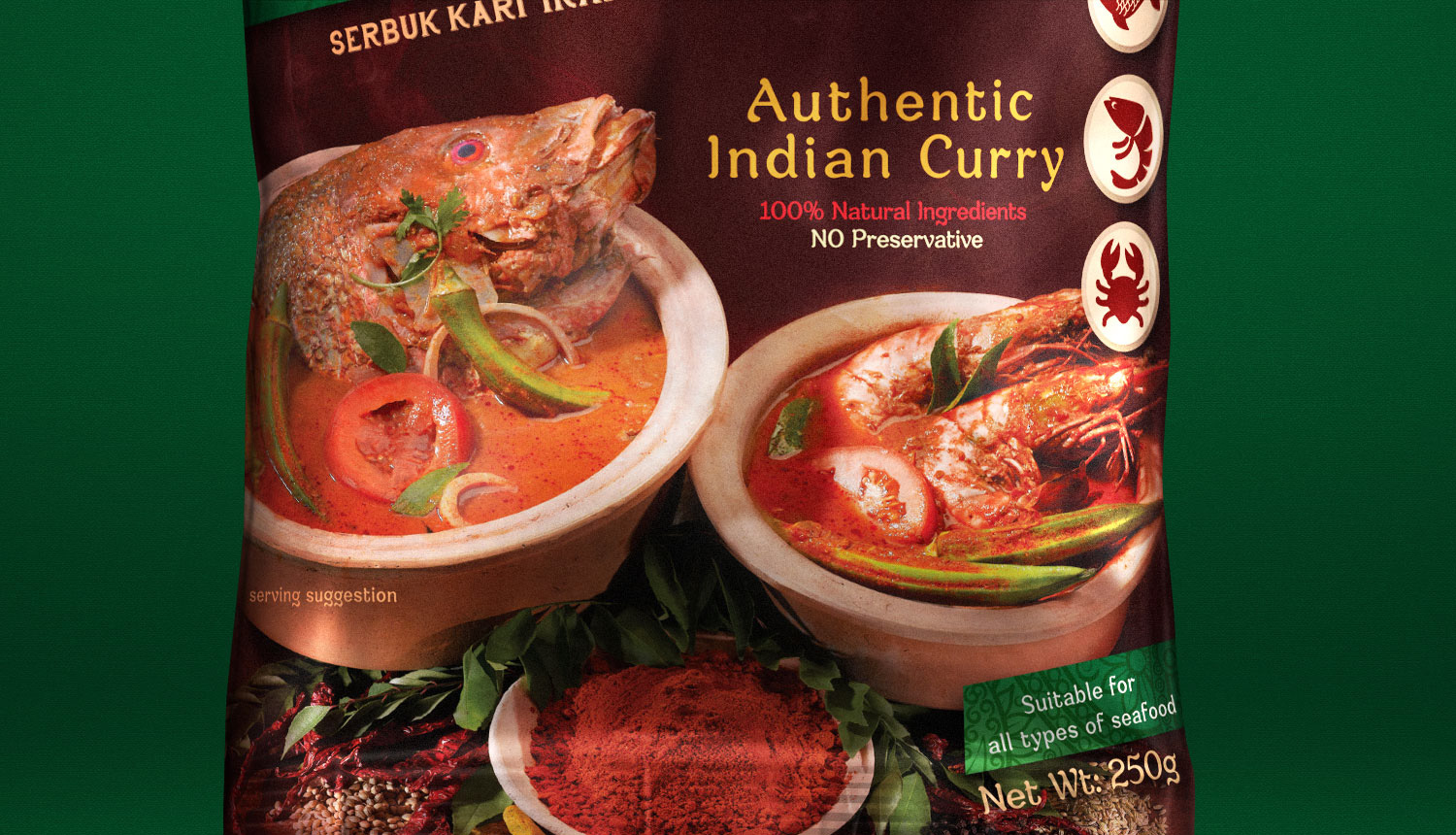
authentic Indian Curry Powder
For more than 20 years, Pattu has been committing to bring the most authentic Indian curry powder to the market. Its 100% natural ingredients from traditional recipe has gained its reputation in Singapore. Pattu began to face tough competition as for 20 years, Sabi Foods - the owner of Pattu brand - has not updated the packaging design. The outdated packaging creates a big gap between consumer’s interest and product aesthetic.
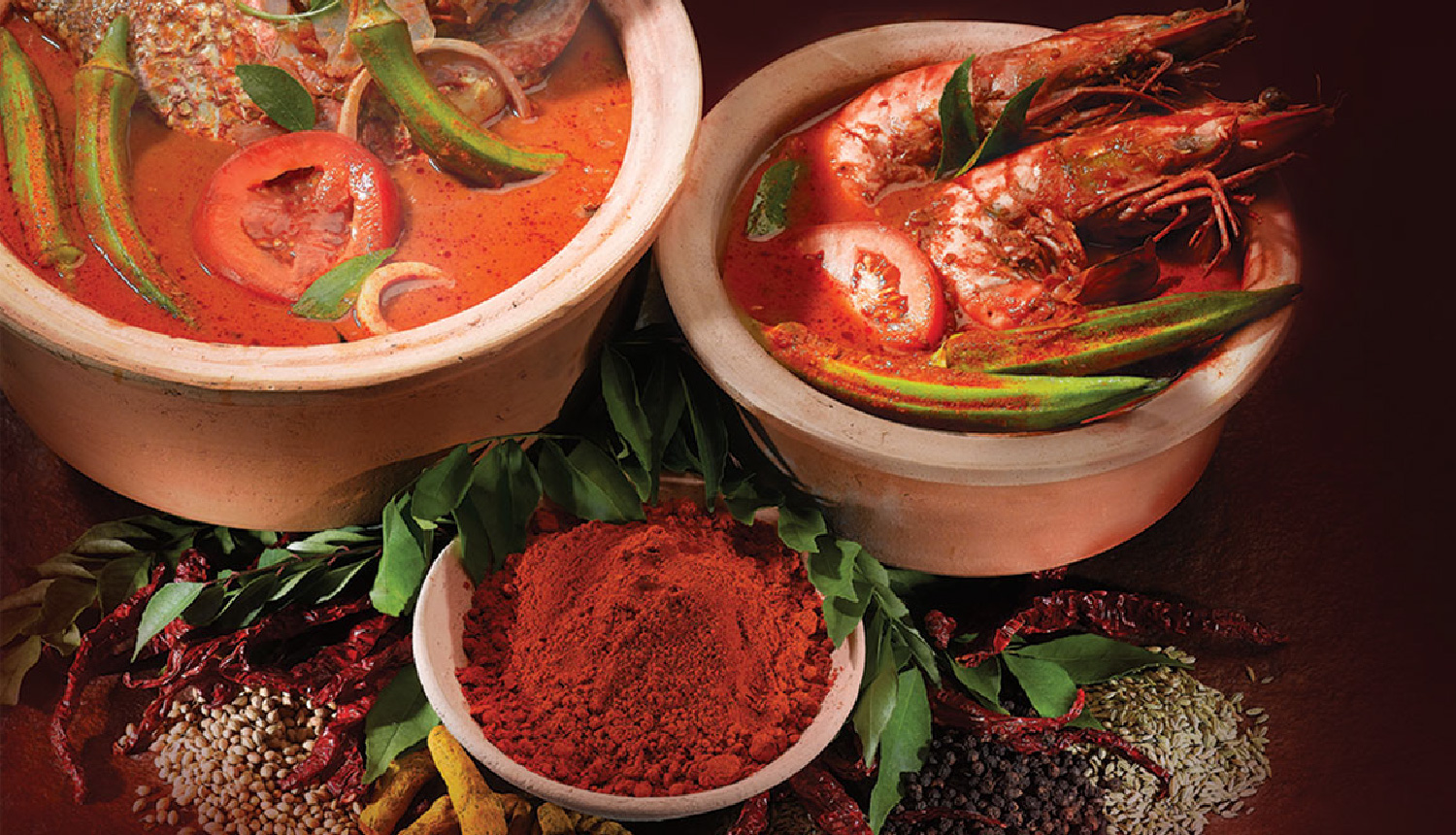
Therefore the primary objective is to recapture that interest and reestablish the connection between the brand and its consumer. Photography as the key visual is styled to capture the authentic look of Indian spices culture. Traditional clay pots, dried spices, and fresh herbs are composed to bring up the richness of the powder. This abundant arrangement will create an appealing image that attracts the consumers. Dark colors scheme and traditional patterns further enhance the Indian essence. Modern icons & illustrations help to communicate the product’s USP clearly and more efficiently.