Jackie
packaging design system revamp

It simply works
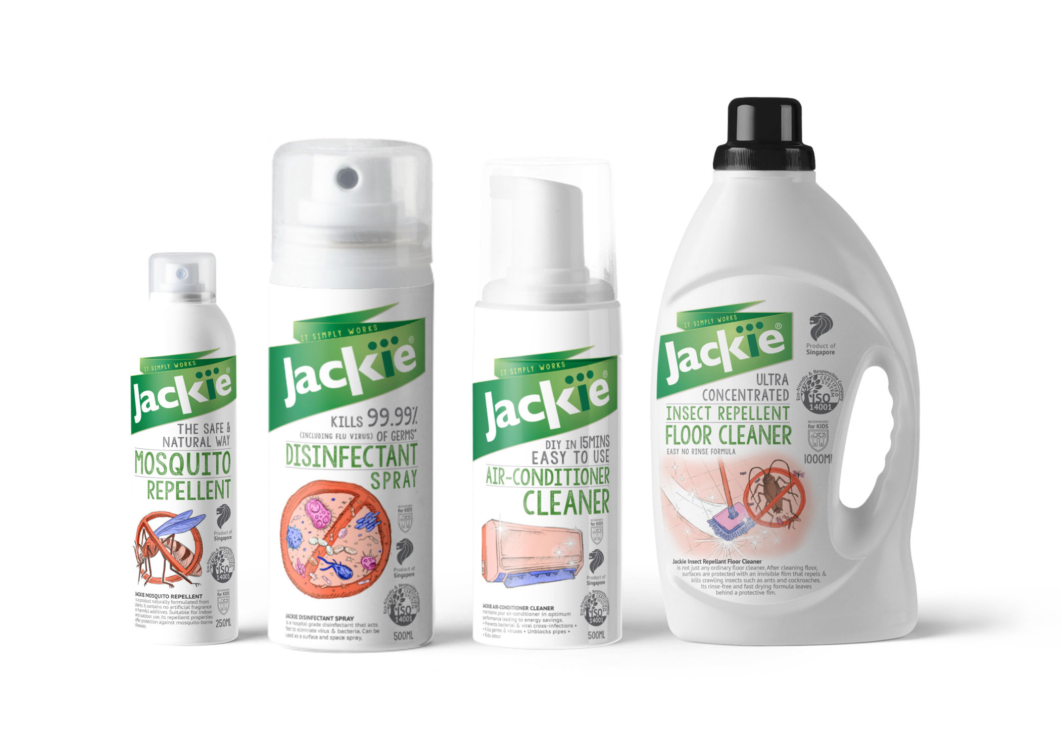
Adiwarna is a leading aerosol manufacturer in Singapore. Even though having successfully supplied its product to the most difficult clients, the regional airlines, Adiwarna with its main brand, Jackie, failed to leave its impact on the retail segment with its massive and messy portfolio.
That is when the new design comes in to set up a clearer tone of voice for the product. The fresher look not only communicates well the company's effort of practicing environment-friendly manufacturing activity but also creates a unity focal point for the brand's visual language. With a more consistent and coherent look, Jackie brand now truly begins its journey capturing the consumer's heart.

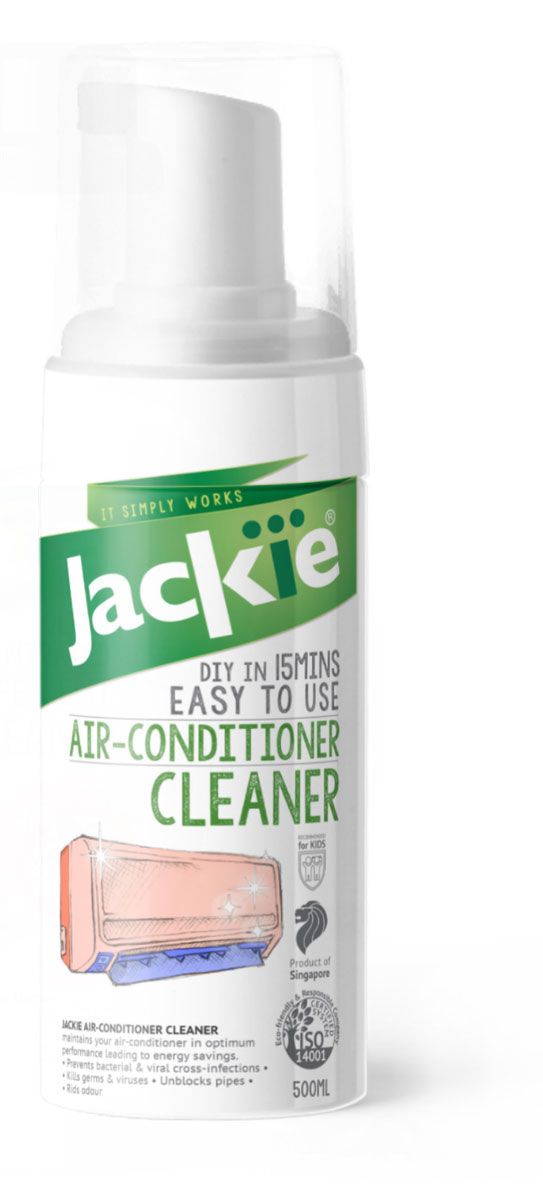
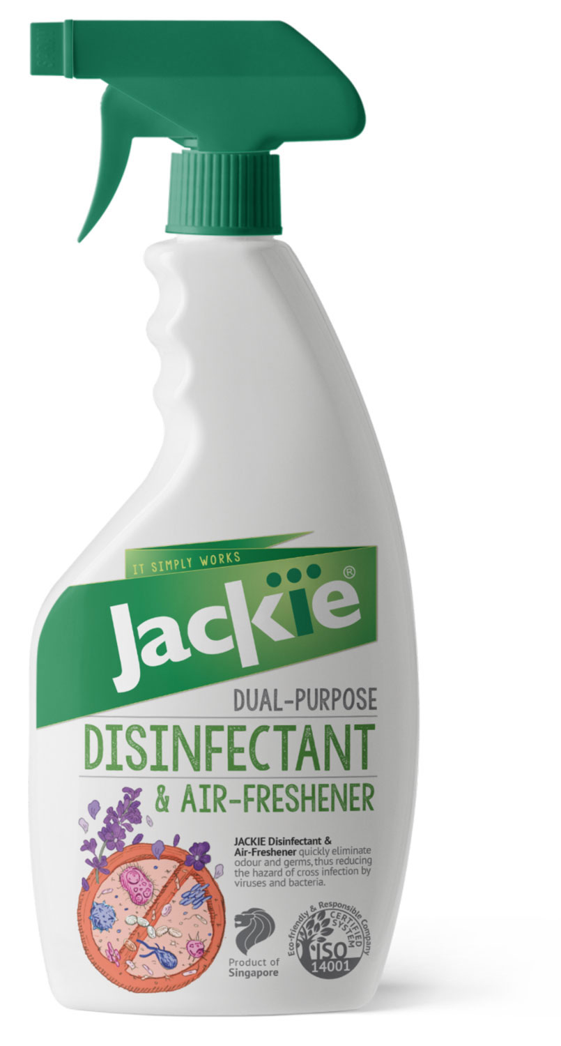
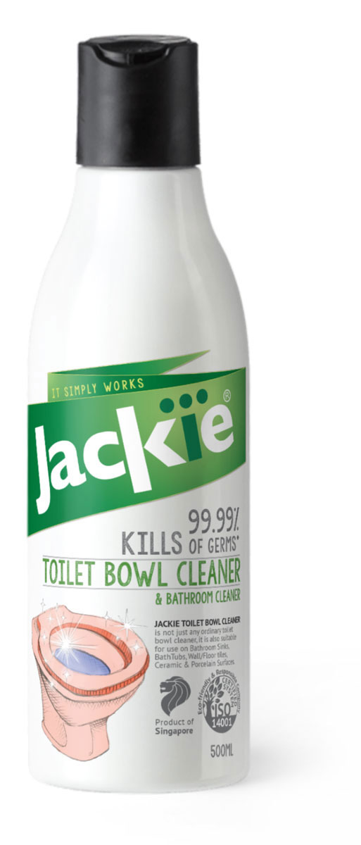
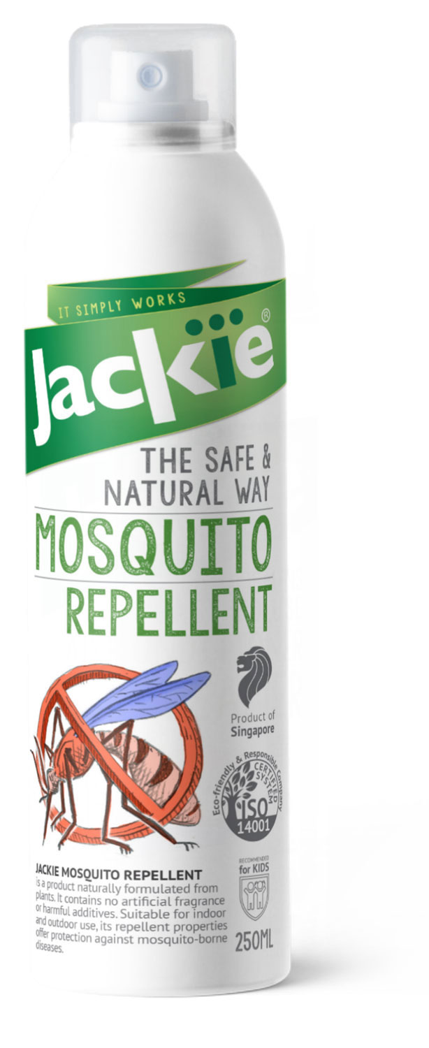
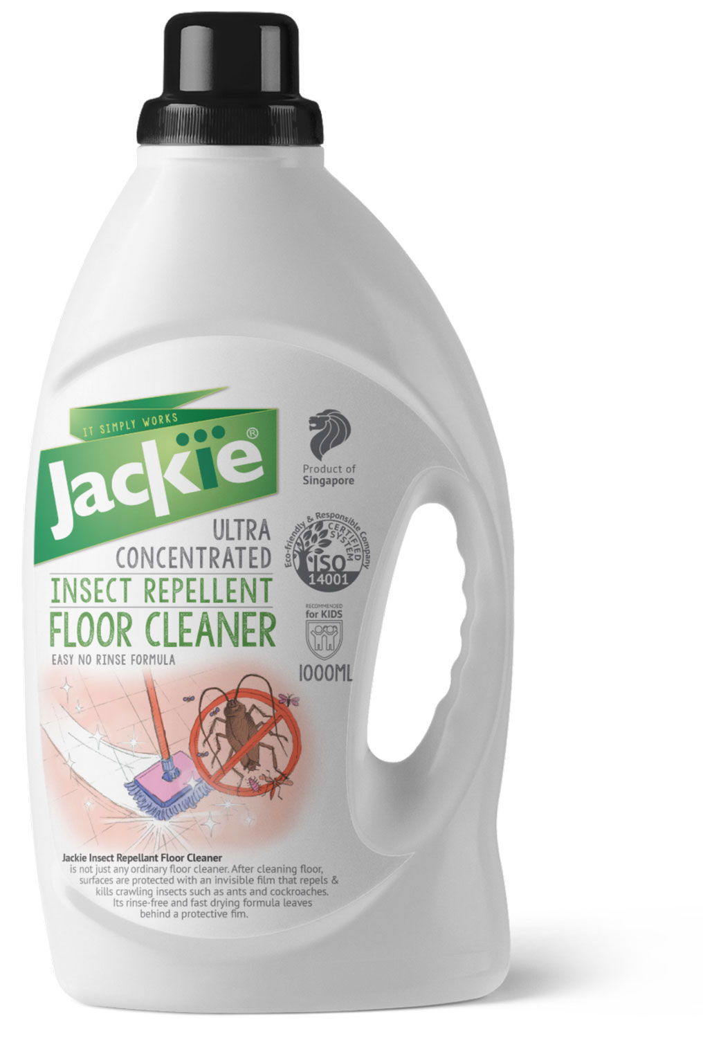
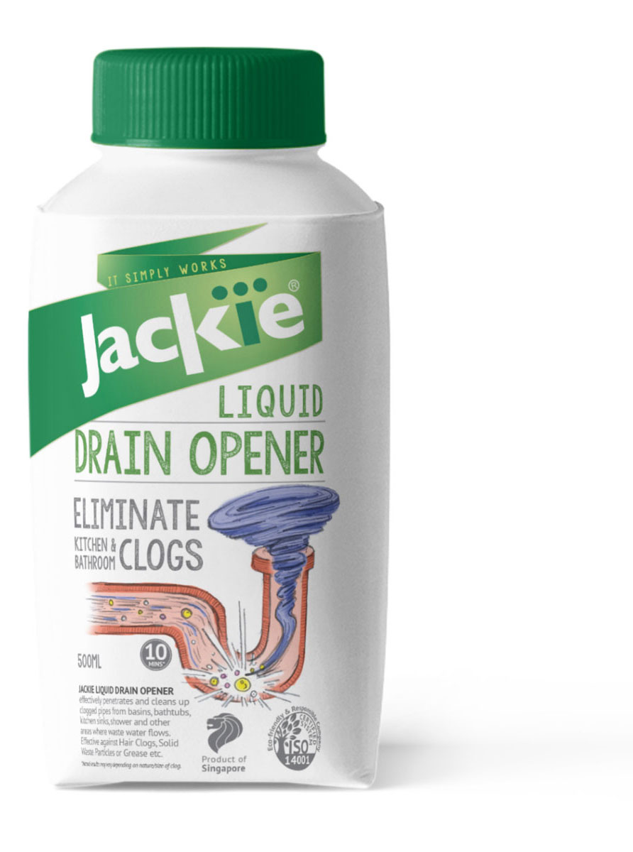
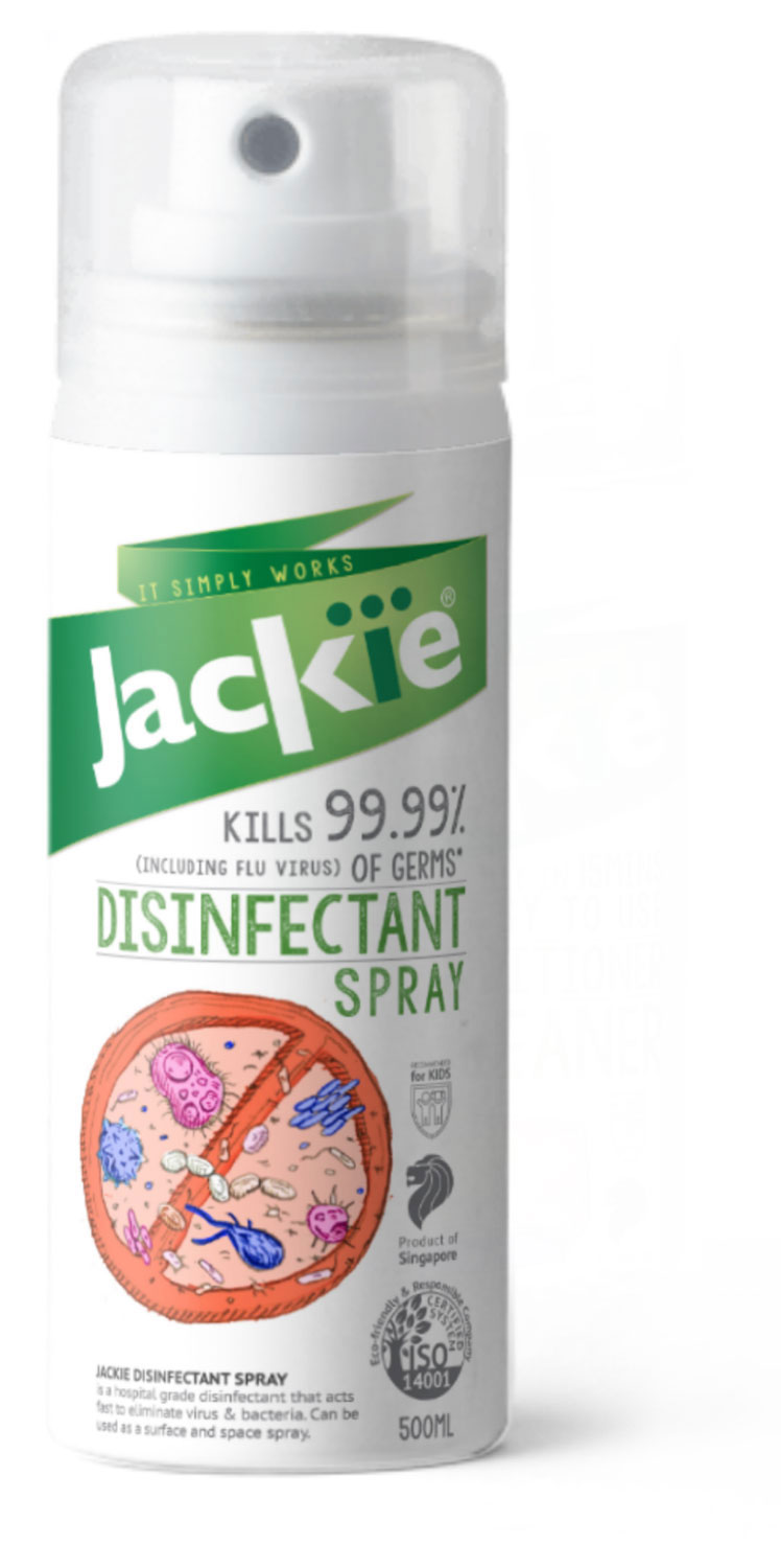
In order to create a memorable look, a bold header banner is introduced as a signature element for the logo. Its robust shape also indicates the fucntionality that the brand promises "it simply works".
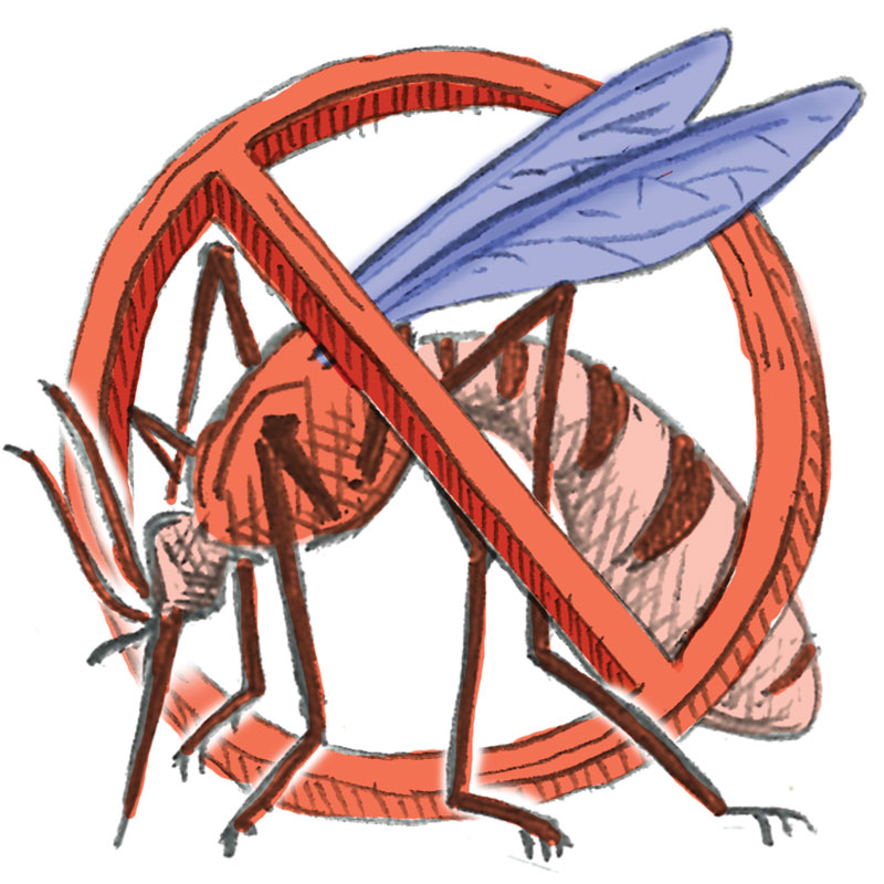
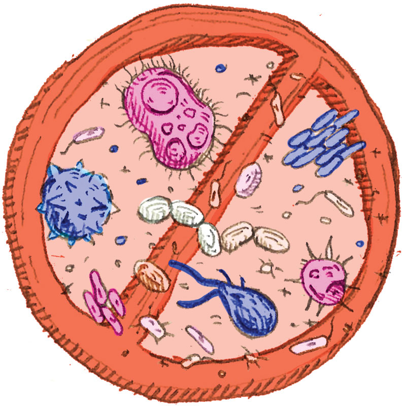

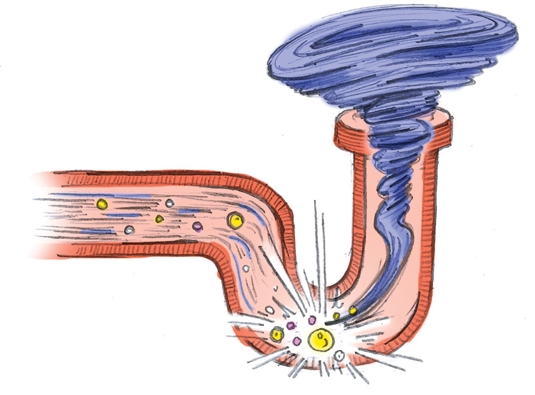
The main product introduction is illustrated in pencil sketch style and soft tone colour that gives the packaging an approachable vibes.